
In 2010, Kevin Systrom (co-creator of Instagram) posted the first-ever Insta post featuring a stray dog he found in Mexico. Since that first unedited, hashtag-free post, Instagram has evolved into a polished, aesthetically driven social media platform whose millions of users favor creativity and unique visual identities.
Visuals are king on Instagram, so creating a unique, eye-catching Instagram aesthetic will convince users to hit that follow button and become part of your growing audience.
Defining your brand voice
A recent report from Marq indicates that 68% of the companies surveyed felt consistent branding across all channels accounts for 10% to 20%+ of their revenue growth. Your brand voice consists of your audience, values, and the feeling you want people to get when they think about your brand (or, as the kids call it, the vibes).
Determine your audience
Your target audience will inform the direction you want to take with your Instagram aesthetic because they’re the primary consumers of your content. Different factors like age, gender, and location influence how you present your brand voice on Instagram. For example, there’s many generational differences in how users interact with Instagram.
Gen Z users prefer personalized content pushed through by the algorithm that entertains and informs. While older generations like Gen X fill their feeds with friend updates and people they choose to follow.
Knowing this, you can modify your content to fit your audience. If Gen Z is your target, post informative, eye-catching images to capture their attention. Ben & Jerry’s feed perfectly showcases this approach to creating an aesthetic.
Not only does the brand capitalize on creating informative and entertaining content for its Gen Z audience, but it also appeals to their needs. This generation is deeply tuned into social issues and expects brands to follow. Ben & Jerry’s feed is filled with politically minded content presented in a way that stays true to its overall aesthetic — bright colors and simple graphics.
Any easy way to start learning about your audience is with Instagram’s built-in insights tool. It shows basic demographics, like how old your audience is, where they live, and what they like and dislike on your feed. Using the right social commerce tool you can gain a deeper understanding of how your audience behaves, how your content performs, and the best times to post for maximum engagement.
Convey your values
Brand values and mission statements might not seem like they have a lot to do with aesthetics, but fusing your brand’s beliefs into how you present yourself on social media builds authenticity and trust with your audience.
Consider what your brand is selling and who you want to attract. On the one hand, brands that cater to teens and promote fun and lighthearted values might create an Instagram aesthetic that leans more toward bright colors, funky lettering, and current trends, like 2000s nostalgia.
On the other hand, sustainability brands often fall on the other side of the spectrum, using earthy tones and simple imagery to convey a “clean” look that mimics minimalist values.
Another way to convey your values through aesthetics is to partner with influencers who align themselves with your brand. Sustainability brands Kotn and Girlfriend Collective regularly work with influencers who create content that fits into the brands’ aesthetics.
Integrating this user-generated content (UGC) into your feed is one of the easiest ways to express authenticity, build trust with your audience, and gather content that perfectly fits in with your aesthetic.
Create your visual identity
Visual identity is one of the most essential aspects of an aesthetic due to Instagram’s heavy emphasis on imagery. It’s also the first thing followers take note of when they find your profile.
Consider colors carefully
Click on any Instagram profile, and the first thing you probably notice is color. Your brand’s colors make you instantly recognizable to followers, elicit emotions from new users, and deliver your message to the audience. The palette you choose also sets the vibe or mood; this defines how you’ll use color, imagery, and captions throughout your feed, so selecting one that suits your brand is vital.
Beauty brand Glossier and trendy glassware brand Helle Mardahl both use soft pastels, nudes, and tons of “millennial pink” within their feeds. Their color palettes instantly evoke a youthful, playful mood that appeals to younger generations, which happen to be their target audience.
Whereas Ritual and Kate Spade use different tactics to create a cohesive Instagram aesthetic. Rather than relying on a singular color scheme, both infuse their signature color throughout their posts to create a unified visual identity.
Brands also use seasonal color schemes, subtly transitioning between darker and lighter tones to mirror the great outdoors, while others build an entirely monochrome feed. Play around with color on a planning app to find what works best for your brand.
Create balance and harmony
Have you ever scrolled through an Instagram feed that made your eyes hurt because it was so busy? Use color harmony and focal point balance to avoid this issue and keep followers on your feed longer. This tactic creates an aesthetic that is more pleasing to the eye, allowing the viewer’s gaze to move easily through the imagery. It also highlights your products, putting them front and center.
Create balance and harmony on your feed by:
- Alternating types of content (minimal vs. detailed, for example)
- Spacing out posts that contain writing to avoid cluttering your feed
- Using a unifying color in each post to create a pleasing path for the eye to follow
- Trying out black-and-white or desaturated photos to ground more colorful shots
by Humankind and Bala both do an excellent job of creating harmonious, balanced feeds that still contain enough visual interest to entice users to stay and click around. by Humankind alternates single and multi-element photos to create a minimalist, simple aesthetic, while Bala uses a combination of detail shots and human elements to keep its feed interesting and clean.
Edit like a professional
Create unmissable, likable content by honing your photo editing skills — because even the current “unedited” aesthetics trend on Instagram takes some skill to achieve. Editing your content helps your aesthetic stay cohesive and keeps your feed looking professional.
Emirates’ Instagram feed is the definition of high-quality editing and a cohesive aesthetic that inspires wanderlust (very fitting for an airline company ✈️). Every line is smooth and clean, the lighting is perfect, and there’s not a blur or off-center angle in sight.
Editing tools like VSCO, Canva, and A Color Story provide pre-made filters and easy-to-use controls that allow you to adjust everything from exposure to grain. You can also save presets so that every image contains the same elements, from lighting to color balance, to create continuity in your feed.
For more extensive editing, Adobe Lightroom is the go-to software for many Instagram users. It’s geared toward professional photographers, which gives you a lot more control over the editing process and allows you to get more granular.
Make trends work for you
Instagram trends can work for your aesthetic, as long as you tailor them to suit your audience, tone, and visual identity. Instagram often prioritizes creators who use trends to produce content by featuring them on the Explore tab, which provides massive exposure to their content. The Explore tab is both a useful resource for sourcing trends and a valuable space for gaining new followers.
Stay up to date on Instagram aesthetic trends because they change very quickly. But don’t jump on every new trend that pops up. Instead, think outside the box and make the trends work with your brand voice.
For example, 1970s nostalgia has been a popular trend throughout 2022, especially in the fashion and beauty space. You can draw inspiration from 70s-inspired color palettes, lighting, or fonts to infuse some trendiness into your aesthetic without sacrificing your visual identity.
Keep your Instagram aesthetic consistent
Applying consistency to every element of your Instagram profile, including Stories and Reels, will create a cohesive aesthetic that’s unmistakably yours (making it easier for followers to spot you in their feeds!) Then keep them coming back by creating a consistent posting schedule.
Plan out your feed
Instead of hoping your images look good together as you post them, plan your Instagram grid in advance. It will help you maintain a more cohesive look, ensure a visually pleasing flow of color, and build balance. As Instagram users quickly scroll down your feed, they’ll see an uninterrupted aesthetic without any awkward transitions between different color palettes or one-off text posts.
Template tools like Preview are a good resource for planning your feed in advance. You can upload multiple images at once and move them around to find the sweet spot. Once you’re happy with how your future feed looks, you can upload with confidence.
Schedule posts
Scheduled posting ensures you never post the wrong image and break your feed planning or accidentally post the same picture twice. Not only is scheduling your posts beneficial for your aesthetic, but it helps grow your follower count because it keeps your brand relevant to Instagram’s algorithm.
According to Shopify, the ideal posting schedule for brands is two stories and one feed post per day, which is a lot when you take posting on every other social media platform into account. Simplify the process by using a Social Publishing tool, which automatically uploads posts for you. It frees up your time, keeps your posting schedule consistent, and is easy to use.
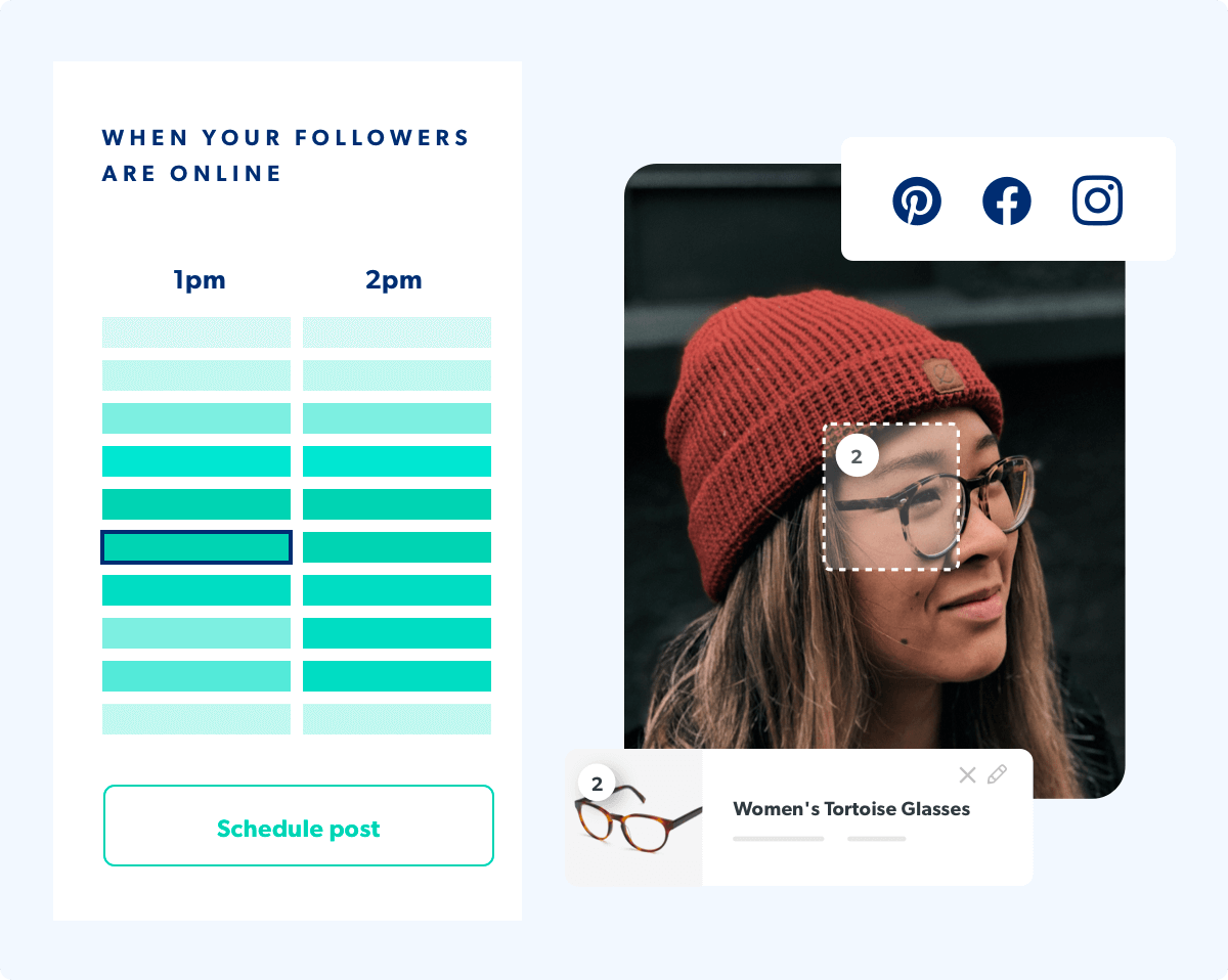
The post scheduler tells you the best time to post content and provides insights to help you tweak your posting schedule for your target audience. Whether they prefer to consume content in the afternoon or in the early hours of the morning, our Social Publishing tool will update your Instagram page (even when you can’t!).
Apply your Instagram aesthetic to other elements of your feed
Your Instagram aesthetic should encompass every element of your presence on the platform — including Instagram Stories, Reels, shoppable content, and highlight thumbnails. This creates a unified look across the entire platform, allows followers to quickly identify your brand, and looks more professional.
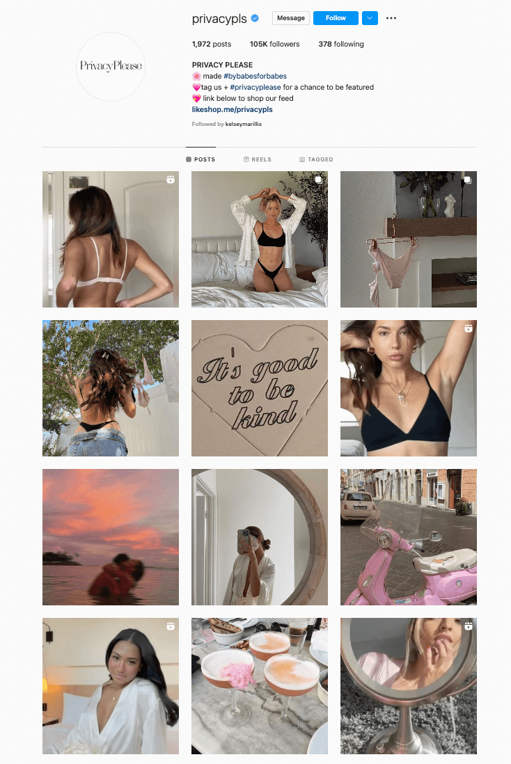
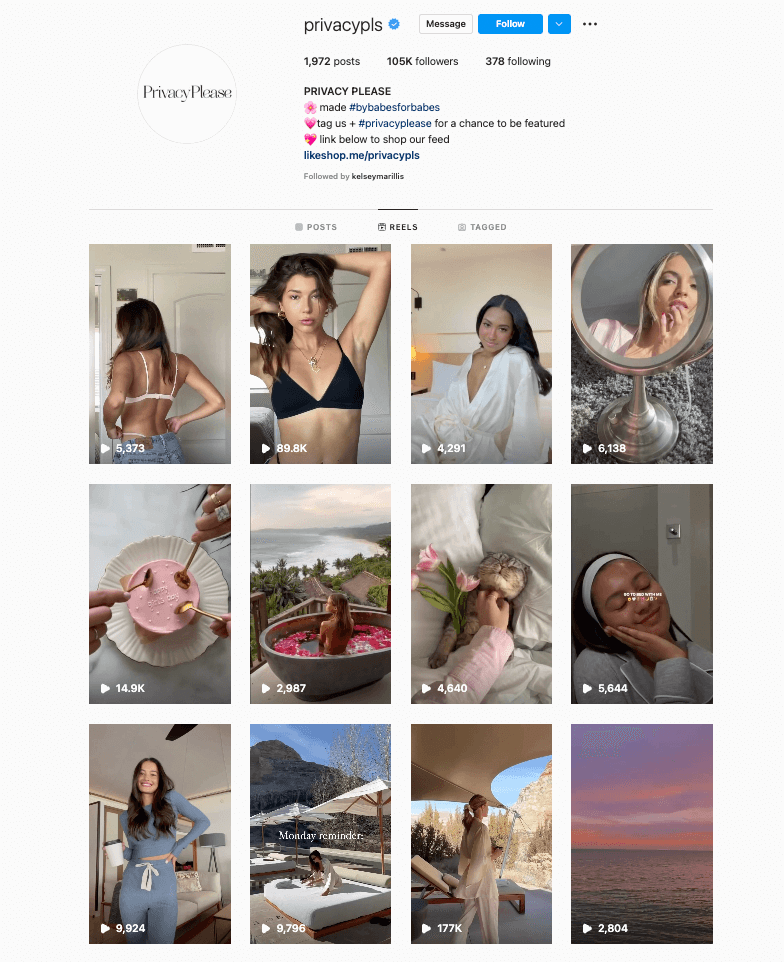
Privacy Please, an e-commerce fashion brand, does this so well that it’s hard to tell the difference between its in-feed posts and its Instagram Reels. The brand honed its simple, UGC-driven aesthetic and curated it throughout all of its Instagram content.
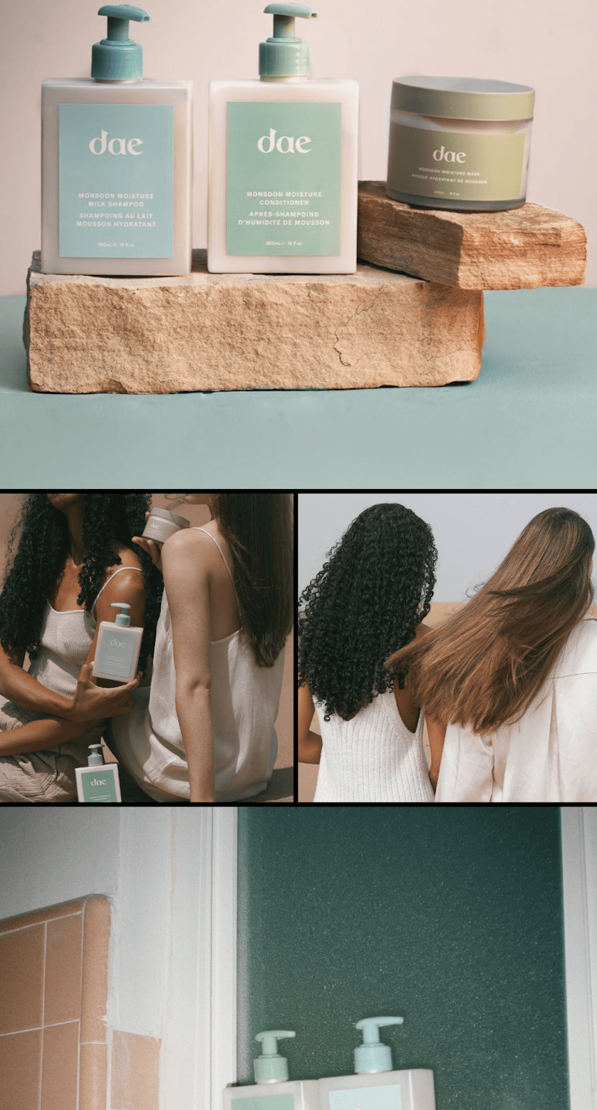
Dae Hair is another brand that seamlessly integrates its aesthetic throughout its content. Its e-commerce shop on Instagram effortlessly mirrors its feed. Using the same earthy tones, grainy film quality, and minimal arrangements in all of its Instagram features makes its aesthetic highly recognizable to followers.
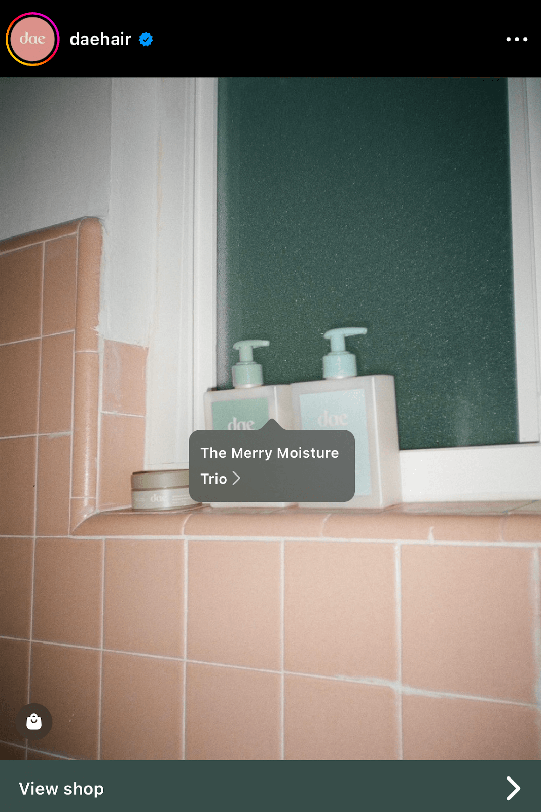
With Instagram prioritizing video content more and more, this is especially relevant for brands who want to quickly build a bigger following through Instagram Reels. Carry over your aesthetic, including color palette, Instagram themes, and mood, into these other areas of Instagram.
Next step to grow your Instagram audience: Get verified
Your Instagram aesthetic communicates your brand’s message to over one billion users on the platform, so ensure it stands out and attracts their attention.
The next step to growing your brand following on Instagram is getting that coveted little blue checkmark. Learn how to get your Instagram account verified with our guide.


